Archive for February, 2010

Mad Men Style

Friday, February 26th, 2010
mad-men-office

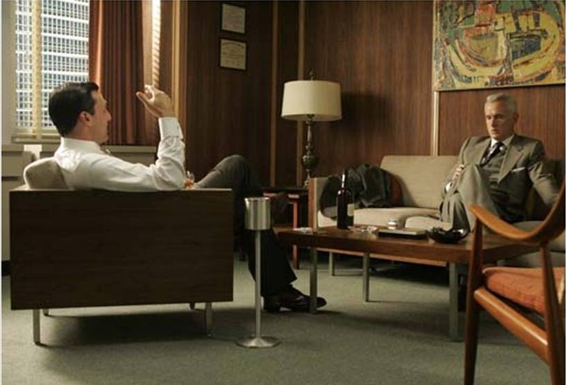
Mad Men, the award-winning dramatic series on the AMC network, has created a renewed interest in the decorating style of the 1960s. Set in Manhattan and a suburb of New York, the show’s home and office interiors reflect the mid-century modern style. Fashion and home décor were clean, cool and sophisticated. The characters on show have more than their share of problems, but their approach to style is decidedly modern and grownup.

The post-modern style was soon replaced by flower power, orange shag carpets and other excesses of the 1970s. Now you can take a step back in time – tune into Mad Men and get a taste of life in a time when no respectable executive would be caught dead without his fedora.

See adman Don Draper deliver one of his best pitches in this YouTube video from Mad Men.

Category: Uncategorized | Comments (0) | Author:

The Most Famous Homes in the World

Friday, February 19th, 2010

01_famous_houses

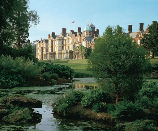
Architectural Digest has a slideshow of some of the most famous homes from around the world. This palatial estate is Sandringham and is located about 100 miles from London. It’s the private country residence of Queen Elizabeth II. Built by Edward VII in 1870 when he was Prince of Wales, Sandringham has been home to four generations of Britains royals. Visit the Architectural Digest website and a see a dozen more beautiful homes.

Category: Uncategorized | Comments (1) | Author:

Maximizing Space in a Small Kitchen

Friday, February 12th, 2010

White_Kitchen

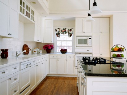
One of the top remodeling projects is increasing the size of small kitchen. What if you would rather not spend the money on an expensive kitchen remodel? There are several ways you can maximize your kitchen workspace and decorate it to appear larger.

Here are 5 tricks for making a small kitchen feel larger, courtesy of Better Homes and Gardens:

  • Decorate with white. When walls, cabinets and countertops are white, the kitchen will appear to be more spacious.
  • Use exposed storage. Remove some cabinet doors or replace them with glass doors. When the cabinets are well-organized, this will add a feeling of depth to the walls.
  • Maximize available natural light by keeping window treatments minimal. User shutters, blinds or curtains that can be easily opened during the day.
  • Raise the focus. Make ceiling appear higher by drawing the eye upward with crown molding or decorative displays (such as a plate collection) near the ceiling.
  • Remove clutter from counters and shelves. This is one of the most effective ways to increase your workspace and make your kitchen appear roomier. Give away unnecessary appliances and collectibles or find an out-of-sight place to store them.
  • Category: Uncategorized | Comments (0) | Author:

    Light Bulb or Candles?

    Thursday, February 04th, 2010

    500x_bulb_candle4

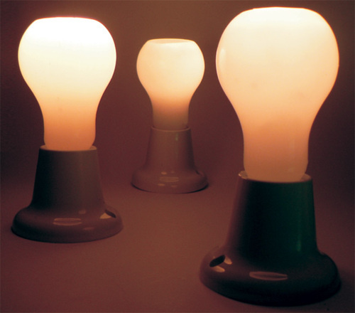
    The Light Bulb Effect is not a standalone battery operated bulb – it’s actually a cleverly designed wax candle and holder. The blub-shaped candle burns down the center, preserving its round shape. The candle is design by Helbert Ferreira and Remi Melander of System Design Studio. These are the most eco-friendly light bulbs ever.

    Category: Uncategorized | Comments (0) | Author:

    Mark Austin Homes